Mastering CSS Layouts: Flexbox and Grid Explained😎


»» Understanding Flexbox : Aligning and Distributing Items Easily
Flexbox is short for Flexible Box Layout Module.
Flexbox is a layout method for arranging items in rows and columns.
Flexbox makes it easier to design a flexible responsive layout structure, without using float or positioning.
CSS flexbox is supported in all modern browsers.
→ CSS Flexbox Components
A flexbox always consist of :
flex container→ the parent container
flex items →items inside the parents
To start using flexbox we use display flex property.
A flex container with three flex items:
<div class="flex-container">
  <div>1</div>
  <div>2</div>
  <div>3</div>
 </div>

Justify-content
The
justify-contentproperty aligns items in the flexible container.It is used when items do not take up all the available space on the main axis (horizontally).
Justify-content :center
Align the flex items at the center of the container:
  div {
    display: flex;
    justify-content: center;
  }
Align-items : center
The align-items property specifies the default alignment for items inside a flexbox or grid container.
we apply align-items center when we have one row or column.
Center the alignments for all the items of the flexible <div> element:
div {
  display: flex;
  align-items: center;
}
Flex wrap CSS
The flex-wrap property specifies whether the flexible items should wrap or not.
Note: If the elements are not flexible items, the flex-wrap property has no effect.
div {
  display: flex;
  flex-wrap: wrap;
}
Align-content : center
he align-content property specifies how flex lines are distributed along the cross axis in a flexbox container.
we apply align-content when we have two or more rows and column.
div {
  width: 70px;
  height: 300px;
  border: 1px solid #c3c3c3;
  display: flex;
  flex-wrap: wrap;
  align-content: center;
}
Gap Property
The gap property define the size of the gap between the row and between the column in flexbox , grid or multiple layouts.
.grid-container {
  gap: 50px;
}
Order
The order property specifies the order of a flexible item relative to the rest of the flexible items inside the same container.
div#myRedDIV {order: 2;}
div#myBlueDIV {order: 4;}
div#myGreenDIV {order: 3;}
div#myPinkDIV {order: 1;}
Flex-grow
The flex-grow property specifies how much the item will grow relative to the rest of the flexible items inside the same container.
div:nth-of-type(1) {flex-grow: 1;}
div:nth-of-type(2) {flex-grow: 3;}
div:nth-of-type(3) {flex-grow: 1;}
Flex-shrink
The flex-shrink property specifies how the item will shrink relative to the rest of the flexible items inside the same container.
div:nth-of-type(2) {
  flex-shrink: 3;
}
Align-self
The align-self property specifies the alignment in the block direction for the selected item inside a flexbox or grid container.
#myBlueDiv {
  align-self: center;
}
»» CSS GRID BASICS : Creating Complex Layouts with Ease
The Grid Layout Module offers a grid-based layout system, with rows and columns.
The Grid Layout Module allows developers to easily create complex web layouts.
The Grid Layout Module makes it easier to design a responsive layout structure, without using float or positioning.
The CSS grid properties are supported in all modern browsers.
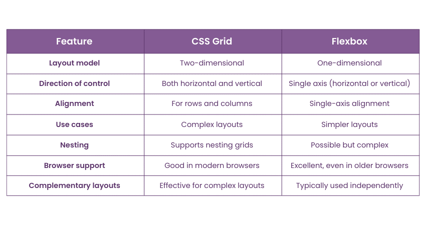
The CSS Grid Layout should be used for two-dimensional layout, with rows AND columns.
The CSS Flexbox Layout should be used for one-dimensional layout, with rows OR columns.
Grid Container and Grid Items
A grid layout consists of a parent element (the grid container), with one or more child elements.
All direct children of the grid container automatically become grid items.
Display Grid Property
An HTML element becomes a grid container when its display property is set to grid or inline-grid.
.container {
  display: grid;
}

.container {
  display: inline-grid;
}
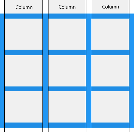
Grid Columns
The vertical lines of grid items are called columns.
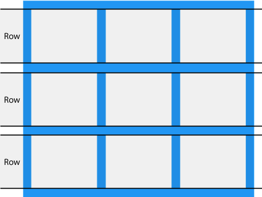
Grid Rows
The horizontal lines of grid items are called rows.
Grid Gaps
The spaces between each column/row are called gaps.
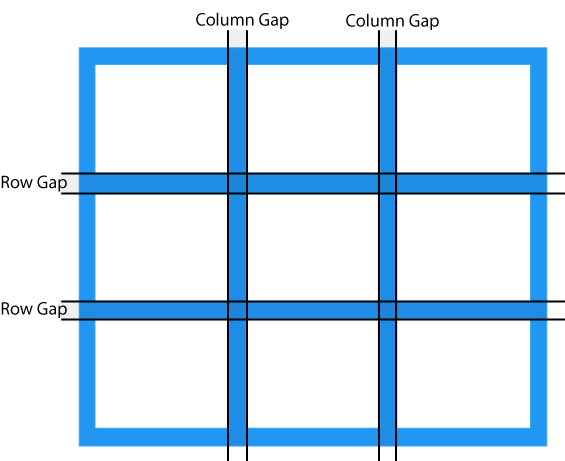
You can adjust the gap size by using one of the following properties:
column-gaprow-gapgap
The column-gap Property
The column-gap property specifies the gap between the columns in a grid.
.container {
  display: grid;
  column-gap: 50px;
}
The row-gap Property
The row-gap property specifies the gap between the rows in a grid.
.container {
  display: grid;
  row-gap: 50px;
}
The gap Property
The gap property is a shorthand property for row-gap and column-gap:
.container {
  display: grid;
  gap: 50px 100px;
}
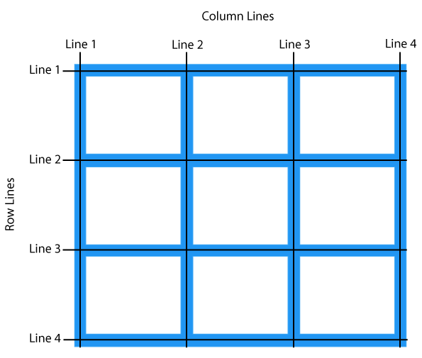
Grid Lines
The lines between columns are called column lines.
The lines between rows are called row lines.
CSS GRID LAYOUT
<!DOCTYPE html>
<html>
<head>
<style>
.container {
  display: grid;
  grid-template-areas:
    "header header"
    "menu content"
    "footer footer";
  grid-template-columns: 1fr 3fr;
  gap: 5px;
  background-color: #2196F3;
  padding: 5px;
}
.container > div {
  background-color: rgba(255, 255, 255, 0.8);
  padding: 10px;
}
.container > div.header {
  grid-area: header;
  text-align: center;
}
.container > div.menu {
  grid-area: menu;
}
.container > div.content {
  grid-area: content;
}
.container > div.footer {
  grid-area: footer;
}
</style>
</head>
<body>

<h1>CSS Grid Layout</h1>

<p>The Grid Layout Module offers a grid-based layout system, with rows and columns.</p>
<p>The Grid Layout Module makes it easy to design complex and responsive web pages without using floats and positioning:</p>

<div class="container">
  <div class="header"><h2>My Header</h2></div>
  <div class="menu"><a href="#">Link 1</a><br><a href="#">Link 2</a><br><a href="#">Link 3</a></div>
  <div class="content"><h3>Lorem Ipsum</h3><p>Lorem ipsum odor amet, consectetuer adipiscing elit. Ridiculus sit nisl laoreet facilisis aliquet. Potenti dignissim litora eget montes rhoncus sapien neque urna. Cursus libero sapien integer magnis ligula lobortis quam ut.</p></div>
  <div class="footer"><h4>Footer</h4></div>
</div>

</body>
</html>